
Custom email templates are fully-branded designs you compose in a drag-and-drop builder. They're the design surface; Automation is how you fire them on a trigger, and the Booking drawer can send any active template on demand from a transaction.
If a single built-in Simple email covers what you need, use that. Reach for a template when you want a fully-branded design, data-bound blocks (purchased items, payment summary, customer responses), or attachments (invoice PDF, photo).
Getting started
Navigate to Emails and messaging > Templates and automation. The Email templates tab is the default landing page. Click Create email template to open the builder, or click any row to edit an existing template.
How it works
The builder is a three-panel layout.
| Panel | What's in it |
|---|---|
| Left: Components library | Every component you can drop into the canvas, grouped into Standard Components, Custom Components, and Attachments |
| Center: Canvas | The email itself, with three drop zones (Header / Body / Footer) and a desktop / mobile preview toggle in the canvas header |
| Right: Properties | Empty until you click a component; populated with that component's editable properties |
You build a template by dragging components from the left panel into the canvas (or clicking to add). Click any component to select it; its properties appear on the right. Drag the rank handle on a component to reorder, or click the trash icon to delete. The Settings dropdown in the top right manages template metadata, surface availability, and test sends. Save draft keeps the template in draft (won't send and won't appear in pickers); Save & activate flips the status to active so it can be sent or chosen in Automation Send email steps.
Step-by-step guide
Open the builder
| Step | Action |
|---|---|
| 1 | Go to Emails and messaging > Templates and automation |
| 2 | On the Email templates tab, click Create email template (or click an existing template to edit) |
| 3 | The builder opens with breadcrumb Email templates > New template and an empty canvas |
Fill in template settings
Before adding components, set the template metadata. Click the Settings dropdown in the top right, then Template settings.
| Field | Required | Notes |
|---|---|---|
| Template name | Yes | Internal name for the picker and the templates list |
| Template type | Yes | Pick from your configured Email template types (see below). Drives the color / icon badge on the list |
| Description | No | Up to 500 characters with a live word count |
| Subject line | Yes | Up to 255 chars. What recipients see in their inbox |
| Preheader text | Yes | Up to 255 chars. The preview text most inboxes show next to the subject |
| From name | Yes | The friendly "From" name (e.g., your venue name) |
| From email | Yes | The sending address. Must be on a verified domain; otherwise the email won't send |
| Reply-to email | Yes | Where customer replies land |
Click Create template (new) or Update settings (edit) to commit. Back discards.
Drop components into the canvas
The Components library on the left is grouped into Standard Components, Custom Components, and Attachments. Drag any component into the Header, Body, or Footer drop zone. Most components live in Body; Header is for the brand strip at the top, Footer is for the address / social / legal strip at the bottom.
The Body empty state reads:
Start Building Your Email Add rows and drag components into columns, or add components directly
You can drop components directly into Body, or add a Columns row first and drop components into each column.
Standard components
These are the visual layout primitives.
| Component | What it does |
|---|---|
| Columns | A row with 1, 2, or 3 columns. Pick the layout: 1 Column, 2 Equal, 3 Equal, 1/3 + 2/3, 2/3 + 1/3 |
| Header | The branded strip at the top of the email. Logo image plus background color and alignment |
| Footer | The strip at the bottom. Logo, social icons, address, and styling |
| Text | A rich-text content block with the Smart variables picker for personalization |
| Button | A call-to-action button with a link |
| Image | An image (uploaded or by URL) with optional click-through link |
| Divider | A horizontal rule with thickness and color |
| Custom HTML | A block that renders raw email HTML you paste or write, for designs the other blocks cannot express |
Custom (data-bound) components
These components render with the actual transaction's data at send time. Drop Payment summary into a template and the email shows that customer's real subtotal, taxes, fees, paid, and due, not placeholder text.
| Component | What it renders | Key configuration |
|---|---|---|
| Purchased items | Line items with name, quantity, and price | Show price column toggle; Show ticket categories toggle; Show end time toggle; language; font and color theme |
| Payment summary | Subtotal, fees, taxes, discounts, total, paid, due | Show payment status toggle; language |
| Applied payments | Payment method, transaction ID, amount per payment | Show total toggle; show sample data; currency symbol |
| Customer responses | The customer's answers to your booking-site custom fields | Language; question size; answer size; question / answer colors |
| Billing info | Customer name, email, payment status badge | Language; paid status color; unpaid status color |
| Event | Event name, image, description, ratings, duration, group size | Layout (image top / left / right); show toggles for each field. Show ratings lists every rating of the event that customers can see, each under its own name |
| Event host | The assigned host's name, image, role | Layout (image left / right / top); image shape (circle or square); show role toggle |
| Project ticket | Ticket title, description, assignee, project, time estimate, latest comment, action button | Display toggles for each of the 8 sections; button text and link type |
| Gift card | Gift card code, amount, expiration, remaining balance, personal message | Layout (image top / left / right); display toggles for image, message, total, remaining, dates. Whether the expiration line actually renders on a live send depends on the gift card type's Show the expiration date on the gift card delivery email toggle (Gift card types): when that's off, the expiration is suppressed even on custom and automated emails |
| Changes | The change log for the booking with timestamps and who made the change | Show additional info toggle; show booking reference toggle |
Attachments
These don't render in the email body. They attach a file to the outgoing email.
| Attachment | What it does | When skipped |
|---|---|---|
| Invoice | Attaches the invoice PDF for the transaction | Skipped if the transaction has no invoice yet (e.g., zero-balance bookings) |
| Photo | Attaches the player photo for the booking | Skipped if no photo exists for the booking |
Edit a component's properties
Click any component on the canvas. The Properties panel on the right populates with its editable properties. Properties are grouped into sections (Appearance, Spacing, Typography, etc.). Each block type has its own property set; the common groups are covered first, then per-component specifics.
Common property groups
| Group | Controls |
|---|---|
| Appearance | Background color (with an Inherit button that resets to parent), text color, border toggle and color, border radius |
| Spacing | Top margin and bottom margin (sliders, typically 0 to 50px in 2px steps) |
| Typography | Font family (filterable dropdown), font size (number input), font weight |
Color pickers throughout the builder have six brand presets plus a custom color input:
- Primary pink
#e14eca - Blue
#1d8cf8 - Teal / green
#00bf9a - Coral
#ff8d72 - Pink / red
#fd5d93 - Purple
#825ee4
The Inherit button on background color resets the block back to its parent's background (useful when you change the canvas background and want a child to follow).
Text component
| Control | Notes |
|---|---|
| Content editor | Rich-text editor for the block's body |
| Smart variables | Button that opens a popover of personalization tokens (see Smart variables section below) |
| Background color | With Inherit button and color presets |
| Top margin / Bottom margin | 0 to 50px (2px steps) |
Button component
| Control | Notes |
|---|---|
| Button text | The visible label |
| Link type | Custom URL, Payment request, Waiver signature, Transaction details page. Picking a dynamic option auto-builds the link per recipient |
| Link URL | Free text URL. Shown only when Link type is Custom URL |
| Button size | Small / Medium / Large |
| Button alignment | Left / Center / Right |
| Background color | Color presets + custom |
| Text color | Color presets + custom |
| Border radius | 0 to 25px slider |
| Top margin / Bottom margin | 0 to 50px (2px steps) |
The dynamic link types resolve at send time:
| Link type | Resolves to |
|---|---|
| Payment request | A unique payment-request URL for the recipient's outstanding balance |
| Waiver signature | The waiver-signing URL for the recipient's booking |
| Transaction details page | The transaction details page for the recipient's order |
Image component
| Control | Notes |
|---|---|
| Image Source | Toggle between Upload (with built-in image editor) and URL |
| Image URL | Shown only when source is URL |
| Alt text | For accessibility and when images fail to load |
| Link URL (optional) | Wraps the image in a clickable link |
| Alignment | Left / Center / Right |
| Width | Slider 50 to 600px (10px steps) plus preset buttons: Small (150px), Medium (300px), Large (450px), Full (600px) |
| Border radius | 0 to 50px |
| Top Margin / Bottom Margin | 0 to 50px (2px steps) |
Divider component
| Control | Notes |
|---|---|
| Line thickness | Thin (1px) / Medium (2px) / Thick (3px) |
| Line color | Color presets + custom |
| Top margin / Bottom margin | 0 to 60px (5px steps) |
Columns component (row)
| Control | Notes |
|---|---|
| Layout | 1 Column, 2 Equal, 3 Equal, 1/3 + 2/3, 2/3 + 1/3. Each rendered as a clickable grid preview |
| Delete row | Trash icon in the row's section header |
Drop components into each column independently. Columns is for arranging blocks side-by-side (e.g., image on the left + text on the right).
Header component
| Control | Notes |
|---|---|
| Logo (Upload or URL) | Upload uses the built-in image editor; URL takes a hosted image link |
| Image width | 100 to 400px slider |
| Background color | Color presets + custom |
| Logo alignment | Left / Center / Right |
| Padding top / bottom | 0 to 80px |
Footer component
| Control | Notes |
|---|---|
| Logo | Upload or URL |
| Social links | Facebook, X (Twitter), Instagram, LinkedIn, YouTube, TripAdvisor, Yelp, website. Each link is independently configurable |
| Typography | Font family, font size, text color |
| Spacing | Padding top / bottom, padding left / right; logo width |
Custom HTML component
The Custom HTML block holds raw email HTML. It suits advanced designs, HTML produced by AI tools, and designs migrated from other email platforms.
Select the block and click Edit HTML in the properties panel. A panel opens with three areas:
| Area | What it does |
|---|---|
| HTML | A code input for the block's HTML, with a live character count. The Smart variables button inserts a variable at the cursor |
| Preview | A live rendering of the HTML that updates as it changes |
| Compatibility | Warnings for styling that email apps handle differently than web browsers, such as flexbox, grid, external stylesheets, and web fonts. Warnings never block saving |
Pasting a complete HTML document (one with html, head, and body tags) converts it automatically: the body content becomes the block, style rules move into a Style rules from your pasted document box (they still apply when the email sends), and stylesheet links are removed with a notice explaining each change.
Unsafe content such as scripts is rejected before the template can be saved, with a message naming each problem. Save stays disabled until the problems are removed.
The properties panel also has Top padding, Bottom padding, and Side padding sliders for spacing around the block.
Tip: Email apps support HTML differently than web browsers. Always send a test email before using custom HTML in a large campaign.
Layout settings and full width
With no component selected, the right sidebar shows Layout Settings for the whole template:
| Setting | What it does |
|---|---|
| Full width layout | Removes the fixed width container so content spans the full width of the email. Useful when a Custom HTML block supplies its own layout |
| Content width | The template's fixed width, 400 to 800 pixels. Hidden while Full width layout is on |
| Canvas background | The color behind the email container |
| Container background | The email container's own color. Hidden while Full width layout is on |
Insert smart variables (personalization)
Smart variables are placeholders that render the recipient's actual data at send time. They live inside Text blocks and Custom HTML blocks (the Custom HTML editing panel has its own Smart variables button).
| Step | Action |
|---|---|
| 1 | Select a Text block on the canvas |
| 2 | In the Properties panel, click Smart variables |
| 3 | The popover opens with a searchable list of available variables |
| 4 | Click a variable to insert it at the cursor position. It inserts as a token like {{customer.firstName}} |
| 5 | At send time, the token renders as the recipient's first name |
Available smart variables:
| Variable | Renders |
|---|---|
{{customer.firstName}} | Customer first name |
{{customer.lastName}} | Customer last name |
{{customer.email}} | Customer email address |
{{booking.id}} | Booking / order ID |
{{booking.date}} | Booking date (formatted with the group's date format) |
{{booking.startTime}} | Booking start time (formatted with the group's time format) |
{{booking.endTime}} | Booking end time (formatted with the group's time format) |
{{booking.duration}} | Length the customer booked, in minutes (for example 90). For an all-day booking it prints the booking's all-day text instead |
{{game.duration}} | Event duration: the event's default length in minutes, from its event details |
{{booking.ticketBreakdown}} | Number of participants in each ticket category of the booking, one category per line (for example Adult: 2) |
{{company.name}} | Your venue's name |
{{company.phone}} | Your venue's phone number |
You can use the same variable as many times as you want in a single template, and combine multiple variables in one block (e.g., "Hi {{customer.firstName}}, your booking on {{booking.date}} from {{booking.startTime}} to {{booking.endTime}} is confirmed."). For data that isn't available as a variable (line items, totals, customer answers), use the equivalent Custom component instead.
Generate content with Biku
Biku, the platform assistant, can build or change a template's content from a written description. The sparkle button at the left of the canvas toolbar opens the Generate with Biku panel; it also appears automatically on a brand new empty template.
| Step | Action |
|---|---|
| 1 | Describe the content, for example "a 20% off comeback offer with a booking button" on an empty template, or "make the book now button green" on an existing one |
| 2 | Click Generate. The template saves first, then Biku designs while the canvas shows Designing your content |
| 3 | When it finishes (up to a minute), the canvas updates and a message reports what was added or updated |
On an empty template Biku composes the full content from the standard and data-bound blocks. On a template with content it adds new sections below the existing ones, or updates existing sections in place when the request describes a change, such as recoloring a button or rewording a heading. Everything it produces is made of normal blocks and stays fully editable.
Tip: Descriptions up to 500 characters work best when they name the goal, the audience, and the mood, for example "an elegant minimal invitation to our new event room, cream background".
Things to know:
- Generating saves the template first, so unsaved canvas changes are kept and saved.
- Each account has 50 generations per day, shared with the platform assistant. Past the limit, generation returns a daily limit message until the next day.
- Requests that are not about email content are declined with a short message and the template is left unchanged.
- Custom HTML produced by Biku goes through the same safety screening as pasted HTML.
Toggle desktop and mobile preview
The canvas header has the Biku sparkle button on the left and two device icons (tablet and mobile) on the right. Click to toggle the canvas between desktop and mobile rendering. The components are unchanged; only the preview width differs. Always preview both before activating, since a layout that works on desktop can break on a phone (especially with multi-column rows).
Settings dropdown
The Settings dropdown in the top right has three options.
| Option | What it opens |
|---|---|
| Template settings | The metadata modal (Name, Type, Description, Subject, Preheader, From name, From email, Reply-to email) |
| Template availability | Which surfaces can use this template (see below) |
| Send test email | Send the template with sample data to your email so you can preview the real rendering |
Template availability
| Option | Effect |
|---|---|
| Show on transaction details page | When on, this template appears in the Booking drawer Customer communication > Send email picker and in the Transaction details Emails > Send an email drawer. When off, it's only usable in Automation Send email steps |
Send test email
| Field | Notes |
|---|---|
| Email address | Required. The template renders with sample data and sends to this address |
The test email uses sample data for any data-bound blocks (purchased items, payment summary, customer responses, etc.), so you see what a real send would look like.
Save and activate
The top right has two save buttons.
| Button | Effect |
|---|---|
| Save draft | Saves with status = draft. Not sendable, not selectable in Automation, not visible in the Booking drawer picker |
| Save & activate | Saves with status = active. Available everywhere |
Save & activate requires that the template has been saved as a draft first (you need a template ID). If you click Save & activate on a never-saved template, you see a "Template not saved" alert that opens the Template Settings modal so you can fill in the required metadata first.
Both buttons validate the required metadata before saving. Missing required fields show inline errors and a "Validation error" alert.
Archive and restore templates
Archiving takes a template out of your Email templates list without deleting it. An archived template keeps its design and its send history, and you can bring it back at any time.
| Step | Action |
|---|---|
| 1 | To archive a template, click the three-dot menu on its row and pick Archive template, then click Archive in the confirmation |
| 2 | To see your archived templates, click Archived in the filter bar, switch it on and click Apply. The list now shows only archived templates, each with an archived status badge |
| 3 | To restore one, click the three-dot menu on its row and pick Restore template, then click Restore in the confirmation |
| 4 | The template leaves the archived list and returns to your templates as a draft. Open it and click Save & activate when it's ready to send again |
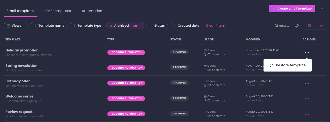
The other filters (Template name, Status and the rest) still work while Archived is on, so you can search your archived templates the same way as your active ones. The switch stays on when you reload the page, and you can save it in a view.
Manage Email template types
Template types are the colored / iconned categories you assign on the Template type dropdown. Manage them from the three-dot menu on the Email templates tab > View email template types.
| Element | Description |
|---|---|
| Page title | Email template types |
| Create template type | Primary button at top right |
| Columns | Type info (icon + name + description), Type (System or Custom badge), Status (Active / Inactive), Usage (template count), Last modified, Actions |
| Per-row actions | Edit template type / Archive template type. System types can't be edited or archived |
The Create template type / Edit template type modal:
| Field | Notes |
|---|---|
| Name | Required. Placeholder: "e.g., Customer onboarding" |
| Description | Optional textarea, max 500 chars |
| Color theme | 6 preset swatches (pink, blue, teal, orange, coral, purple) plus a custom color picker |
| Icon | 16 options: Envelope, Email, Notification, Bell, Chat, Send, Certificate, Gift, Heart, Star, Award, Trophy, Tag, Folder, Business, Calendar |
Reference
Builder layout
| Panel | Contents |
|---|---|
| Left | Components library: Standard / Custom / Attachments |
| Center | Email canvas: Header / Body / Footer drop zones, the Generate with Biku button, and the desktop / mobile preview toggle |
| Right | Properties panel populated by the selected component |
| Top right | Settings dropdown / Save draft / Save & activate |
Components
| Group | Components |
|---|---|
| Standard | Columns, Header, Footer, Text, Button, Image, Divider, Custom HTML |
| Custom | Purchased items, Payment summary, Applied payments, Customer responses, Billing info, Event, Event host, Project ticket, Gift card, Changes |
| Attachments | Invoice, Photo |
Smart variables
| Variable | Renders |
|---|---|
{{customer.firstName}} | Customer first name |
{{customer.lastName}} | Customer last name |
{{customer.email}} | Customer email address |
{{booking.id}} | Booking / order ID |
{{booking.date}} | Booking date |
{{booking.startTime}} | Booking start time |
{{booking.endTime}} | Booking end time |
{{booking.duration}} | Booked length in minutes, or the all-day text for an all-day booking |
{{game.duration}} | Event duration: the event's default length in minutes |
{{booking.ticketBreakdown}} | Participants per ticket category, one category per line |
{{company.name}} | Your venue's name |
{{company.phone}} | Your venue's phone number |
Brand color presets
| Hex | Use |
|---|---|
#e14eca | Primary pink |
#1d8cf8 | Blue |
#00bf9a | Teal / green |
#ff8d72 | Coral |
#fd5d93 | Pink / red |
#825ee4 | Purple |
Columns layouts
| Layout | Ratio |
|---|---|
| 1 Column | Full width |
| 2 Equal | 1fr 1fr |
| 3 Equal | 1fr 1fr 1fr |
| 1/3 + 2/3 | 1fr 2fr |
| 2/3 + 1/3 | 2fr 1fr |
Button link types
| Type | Resolves to |
|---|---|
| Custom URL | The URL you enter in the Link URL field |
| Payment request | The recipient's payment-request URL for their outstanding balance |
| Waiver signature | The recipient's waiver-signing URL |
| Transaction details page | The recipient's transaction details URL |
Image width presets
| Preset | Pixels |
|---|---|
| Small | 150 |
| Medium | 300 |
| Large | 450 |
| Full | 600 |
Divider thickness
| Option | Pixels |
|---|---|
| Thin | 1 |
| Medium | 2 |
| Thick | 3 |
Footer social platforms
Facebook, X (Twitter), Instagram, LinkedIn, YouTube, TripAdvisor, Yelp, website.
Template settings modal
| Field | Required | Max length |
|---|---|---|
| Template name | Yes | n/a |
| Template type | Yes | n/a |
| Description | No | 500 |
| Subject line | Yes | 255 |
| Preheader text | Yes | 255 |
| From name | Yes | 255 |
| From email | Yes | 255 |
| Reply to email | Yes | 255 |
Template availability options
| Option | Effect |
|---|---|
| Show on transaction details page | Makes the template selectable in the Booking drawer Send email picker and the Transaction details Send an email drawer |
Save buttons
| Button | Status set | Validation |
|---|---|---|
| Save draft | draft | Required metadata fields |
| Save & activate | active | Required metadata + template must already be saved as a draft |
Template type modal
| Field | Notes |
|---|---|
| Name | Required |
| Description | Optional, max 500 chars |
| Color theme | 6 presets + custom |
| Icon | 16 options |
Custom block configuration matrix
| Block | Layout options | Display toggles | Other notable controls |
|---|---|---|---|
| Purchased items | n/a | Show price column; Show ticket categories; Show end time | Language; font/color theme |
| Payment summary | n/a | Show payment status | Language |
| Applied payments | n/a | Show total; show sample data | Currency symbol |
| Customer responses | n/a | n/a | Language; question / answer sizes and colors |
| Billing info | n/a | n/a | Language; paid / unpaid status colors |
| Event | image-top / image-left / image-right | image, description, ratings, duration, group size | Details layout: grid or vertical |
| Event host | image-left / image-right / image-top | role | Image shape: circle / square |
| Project ticket | n/a | 8 toggles: title, description, assignee, project name, project key, time estimate, latest comment, button | Button text, size, alignment, link type |
| Gift card | image-top / image-left / image-right | image, personal message, total, remaining, activation date, expiration date | Code styling (monospace font, color, border) |
| Changes | n/a | additional info, booking reference | Extensive color theming |
Languages supported on data-bound blocks
English, Español, Français, Svenska, Ελληνικά, Dansk. The block's labels translate; the underlying data does not. Blocks without an explicit language follow the location's default language.
Good to know
- Templates and Automations are independent. A template can be sent directly from the Booking drawer Customer communication > Send email or from the Transaction details Emails > Send an email drawer without an Automation, provided Template availability > Show on transaction details page is on.
- Save & activate requires a draft first. You can't activate a brand-new unsaved template. Click Save draft to create the template record, then Save & activate to flip the status.
- From email needs a verified domain. If your From email's domain isn't verified in Email settings, the send fails. Verify the domain before activating templates that use that address.
- Attachments quietly skip when unavailable. Invoice attaches the transaction's invoice PDF (skipped on zero-balance / no-invoice transactions). Photo attaches the player photo (skipped when none exists). The email still sends, just without the attachment.
- Data-bound blocks render real data at send time. What you see in the canvas is a sample; the actual email uses that recipient's purchased items, payment totals, custom-field answers, etc.
- Show ticket categories replaces the quantity on booking rows. With the toggle on, the Purchased items block lists each ticket category of a booking with its number of participants (
Adult: 2,Child: 1), one per line. Gift cards and items keep their plain quantity. - Show end time adds each booking's end to its date and time. With the toggle on, the Purchased items block shows every booking's start and end (for example
Saturday, 10/18/2026 • 07:00 PM - 08:30 PM), with the end date included when a booking runs past midnight. All-day bookings keep their all-day text. The toggle is off by default. - Booking duration is the length the customer booked.
{{booking.duration}}follows the booking's own start and end, so it reflects the length picked at checkout and any end time staff changed later. Event duration ({{game.duration}}) stays the event's default length. The Event block's duration shows the booked length when the email has a timed booking. - All-day bookings print their all-day text as the duration. For an all-day booking,
{{booking.duration}}prints the all-day text ("All day" unless you changed it), so write it on its own rather than followed by "minutes" if you sell all-day bookings. - The Ticket Breakdown smart variable prints one category per line.
{{booking.ticketBreakdown}}renders the same category list inside a Text block.{{booking.groupSize}}still gives the total as a single number. - The attached invoice follows your invoice settings. The Invoice attachment uses the Invoices section of Payment settings, including Show ticket categories.
- Smart variables only work in Text blocks. They're inserted via the Smart variables button in the Text block's Properties panel. Variables in other places (subject, preheader) aren't supported in the current builder.
- Send test email uses sample data. Test sends won't show real customer data, since the email isn't tied to a real transaction. To verify against a real recipient, send through the Booking drawer Send email picker on a real booking.
- Gift card blocks render their full content on live sends: code, value, balance, message, activation date, and expiration. The live customer-facing email always shows real values. Test-email previews still show empty gift-card fields, because previews don't load real gift card data.
- Column layouts are fixed templates. The five Columns layouts (1, 2 Equal, 3 Equal, 1/3+2/3, 2/3+1/3) cover the common cases; arbitrary column widths aren't supported in the current builder.
- Mobile preview is essential. Multi-column rows stack on phones; make sure the stacked order makes sense (e.g., image first, then text, not the other way around).
- Activation status drives visibility. Drafts don't appear in the Booking drawer Send email picker, the Transaction details Send an email drawer, or Automation Send email step pickers. Save & activate to make them selectable.
- Per-toggle inline saves apply across the landing page. Activating / deactivating from the templates list takes effect immediately with a toast confirmation.
- Editing an active template affects future sends only. Past emails were rendered and sent at the time of the trigger. Your edits apply to future sends; past sends are not retroactively updated.
- Copy to other groups is a one-shot clone. It clones the template (and all its components and settings) to other company groups. After copy, each group's copy is independent. Editing the original later doesn't propagate.
- A restored template always comes back as a draft. Even a template that was active when you archived it needs Save & activate before it sends again, so nothing goes out by surprise.
- Two templates can't share a name. If another template already uses the archived template's name, Restore template is blocked and a message names the conflict. Rename the other template, then restore this one.
- Archived templates can't be opened or duplicated. Restore a template first to edit it, preview it or make a copy.
FAQ
Q: How is a template different from a Simple email?
A: Simple emails are the 13 built-in transactional types. They have a fixed format and a fixed firing schedule (booking confirmation on booking, payment receipt on payment, etc.). Templates are fully-custom designs with the drag-and-drop builder. Templates fire from the Booking drawer Send email action, from the Transaction details Send an email drawer, or from a multi-step Automation flow.
Q: Why doesn't my template appear in the Send email picker?
A: Three things to check: 1) Status is active (not draft). Open the template, click Save & activate. 2) Template availability > Show on transaction details page is on. Open the Settings dropdown > Template availability and toggle it on. 3) Your From email's domain is verified in Email settings.
Q: Can I use smart variables in the subject line or preheader text?
A: Not in the current builder. Smart variables only work inside Text blocks via the Properties panel Smart variables picker. The subject line and preheader are static strings set in Template settings.
Q: How do I show how many participants are in each ticket category?
A: Two ways. In a Purchased items block, turn on Show ticket categories to list the categories in the quantity column. In a Text block, insert the Ticket Breakdown smart variable ({{booking.ticketBreakdown}}) from the Booking group.
Q: How do I show when a booking ends or how long it is?
A: Two ways. In a Purchased items block, turn on Show end time to show each booking's start and end. In a Text block, insert End Time ({{booking.endTime}}) or Booking duration ({{booking.duration}}) from the Booking group. In an email covering several bookings, the smart variables describe the first booking, so use the Purchased items block to show every booking's times.
Q: What's the difference between a Text block and a Custom block like Purchased items?
A: A Text block holds free-form text with smart variables. A Custom block (Purchased items, Payment summary, etc.) renders structured data from the transaction at send time. Use a Text block for prose like "Thanks for your booking!"; use a Custom block when you need to show the actual line items or payment breakdown.
Q: How do I add my logo?
A: Drag a Header component into the canvas's Header drop zone, then in Properties click Upload (or URL) and pick your logo. Adjust Image width, Logo alignment, and Background color to match your brand.
Q: Why does my multi-column row look broken on mobile?
A: Multi-column rows stack vertically on mobile. The first column becomes the top section; the last becomes the bottom. Use the canvas's mobile preview toggle (mobile icon in the canvas header) to verify the stack order before activating. If the order is wrong, rearrange the columns so the visually-important one is first.
Q: Can I have multiple From addresses on different templates?
A: Yes. Each template has its own From name, From email, and Reply-to email in Template settings. As long as each From email's domain is verified in Email settings, they all work.
Q: What does the Inherit button on background color do?
A: It resets the block's background to follow its parent (e.g., the canvas or the row). If you change the canvas background and want a block to track that change, click Inherit on the block's background color.
Q: My data-bound block is showing sample data even after activating. Why?
A: The canvas always shows sample data; that's the preview. At send time (whether through Automation or the Booking drawer), the block renders the actual recipient's data. The only way to confirm with real data is to send through the Booking drawer Send email on a real booking, or activate an Automation and let it fire on a real trigger.
Q: Can I duplicate a template instead of building from scratch?
A: Yes. On the Email templates tab, click the three-dot menu on any template row and pick Duplicate. The copy appears as a new draft you can edit independently.
Q: How do I send the same template to multiple groups?
A: From the Email templates tab, click the three-dot menu on the template row and pick Copy to other groups. Pick the target groups; the template (with all components and settings) clones to each. After cloning, each copy is independent; edits to the original don't propagate.
Q: What attachments are supported beyond Invoice and Photo?
A: Just those two today. Invoice attaches the transaction PDF; Photo attaches the player photo. Other attachments (custom files, calendar invites, etc.) aren't currently in the builder.
Q: Why is Save & activate disabled?
A: One of three reasons: 1) The template was never saved (no template ID yet). Click Save draft first. 2) Required metadata is missing (Name, Type, Subject, Preheader, From name, From email, Reply-to). Open Template settings and complete them. 3) The template is already active, in which case the button label and action are the same (you're just resaving).
Q: How do I deactivate a template?
A: On the Email templates tab, click the three-dot menu on the template row and pick Deactivate. The template stays in the list but moves to draft status and stops appearing in pickers.
Q: Can I get an archived template back?
A: Yes. Switch on Archived in the filter bar on the Email templates tab, click the three-dot menu on the template and pick Restore template. It comes back as a draft, ready to edit and activate.
Q: Can HTML from ChatGPT or another AI tool be used directly?
A: Yes. Add a Custom HTML block and paste it into the Edit HTML panel. Complete documents are converted to block content automatically, and the compatibility list flags styling that email apps may render differently. A test send is recommended before a large campaign.
Q: Does Biku replace what is already on the canvas?
A: No. On a template with content, Biku only adds new sections or updates the specific sections the request describes. Existing content is never removed or reordered.
Q: Can I edit the email from a customer's perspective before sending?
A: Use Settings > Send test email to send the template (with sample data) to your inbox. You'll see what recipients see, including header, footer, and rendered components. For a per-customer preview with real data, send from the Booking drawer Send email picker on a real booking.